analytics.haines.co.nzLive demonstration
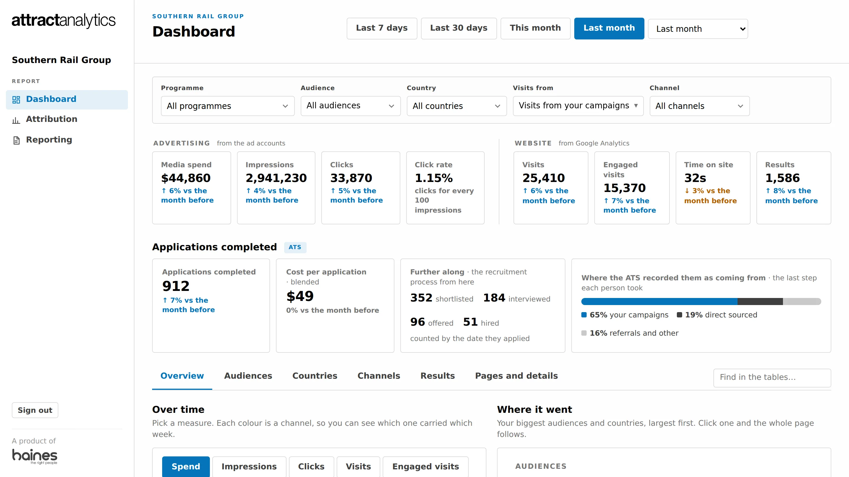
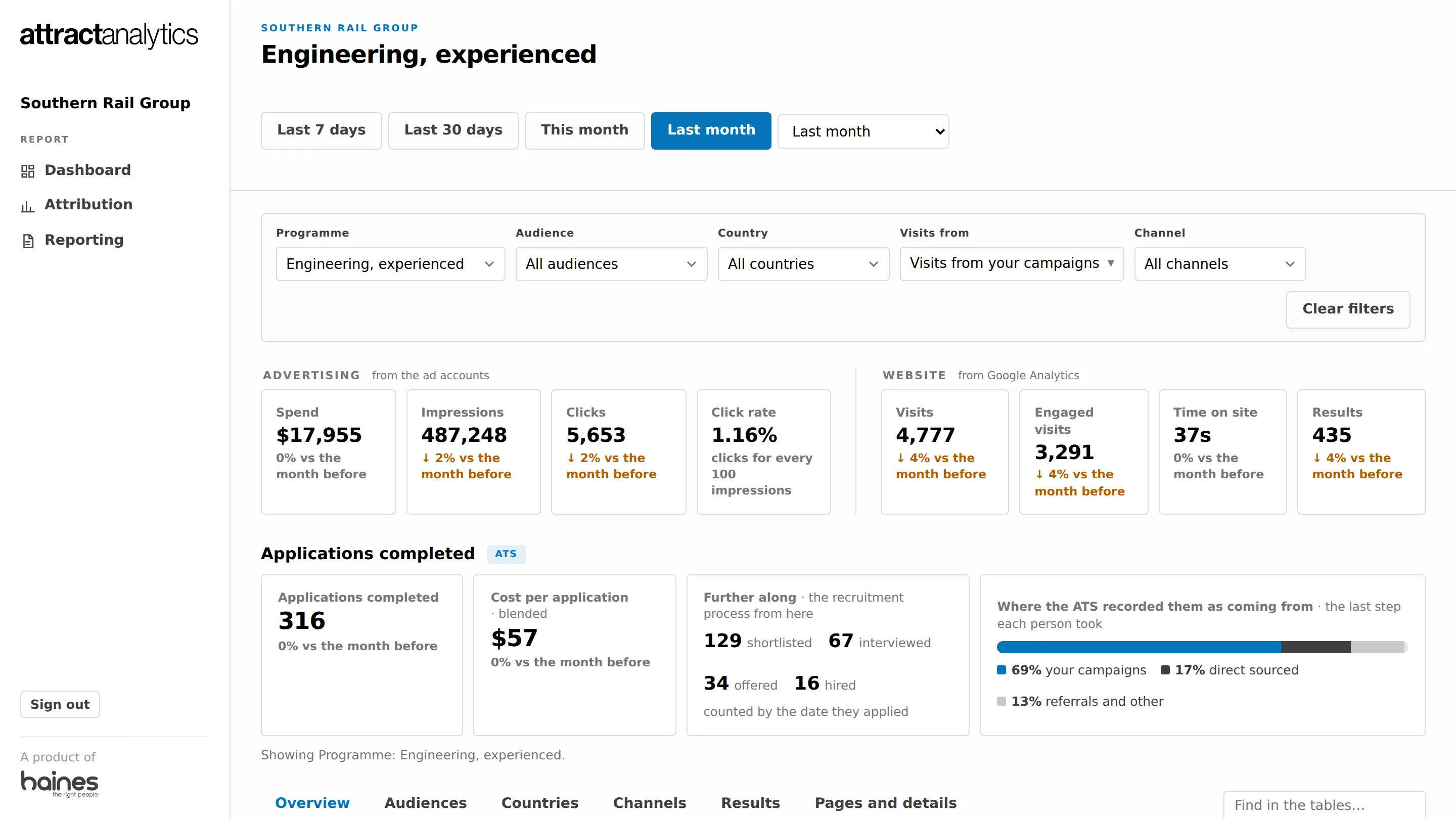
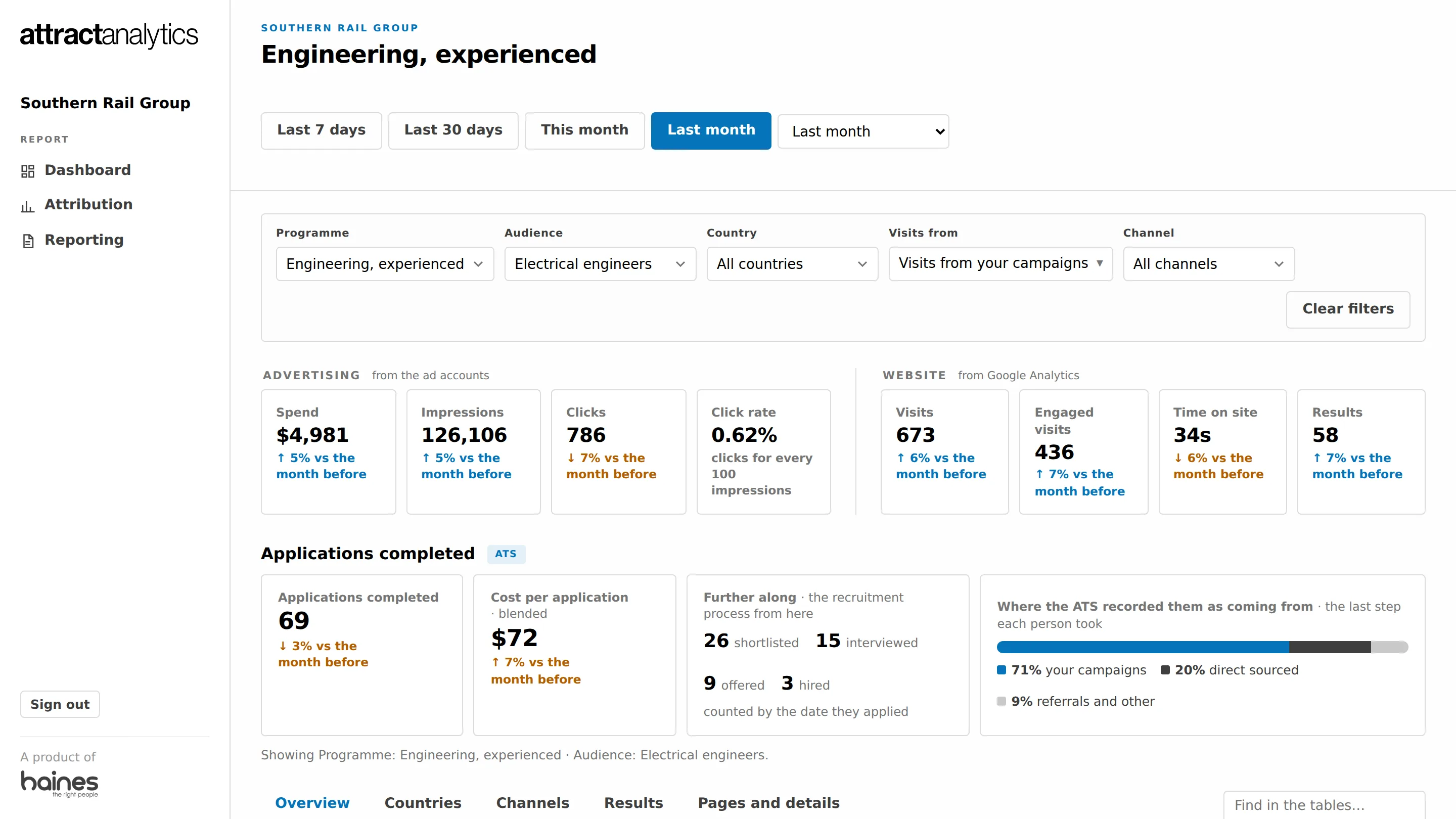
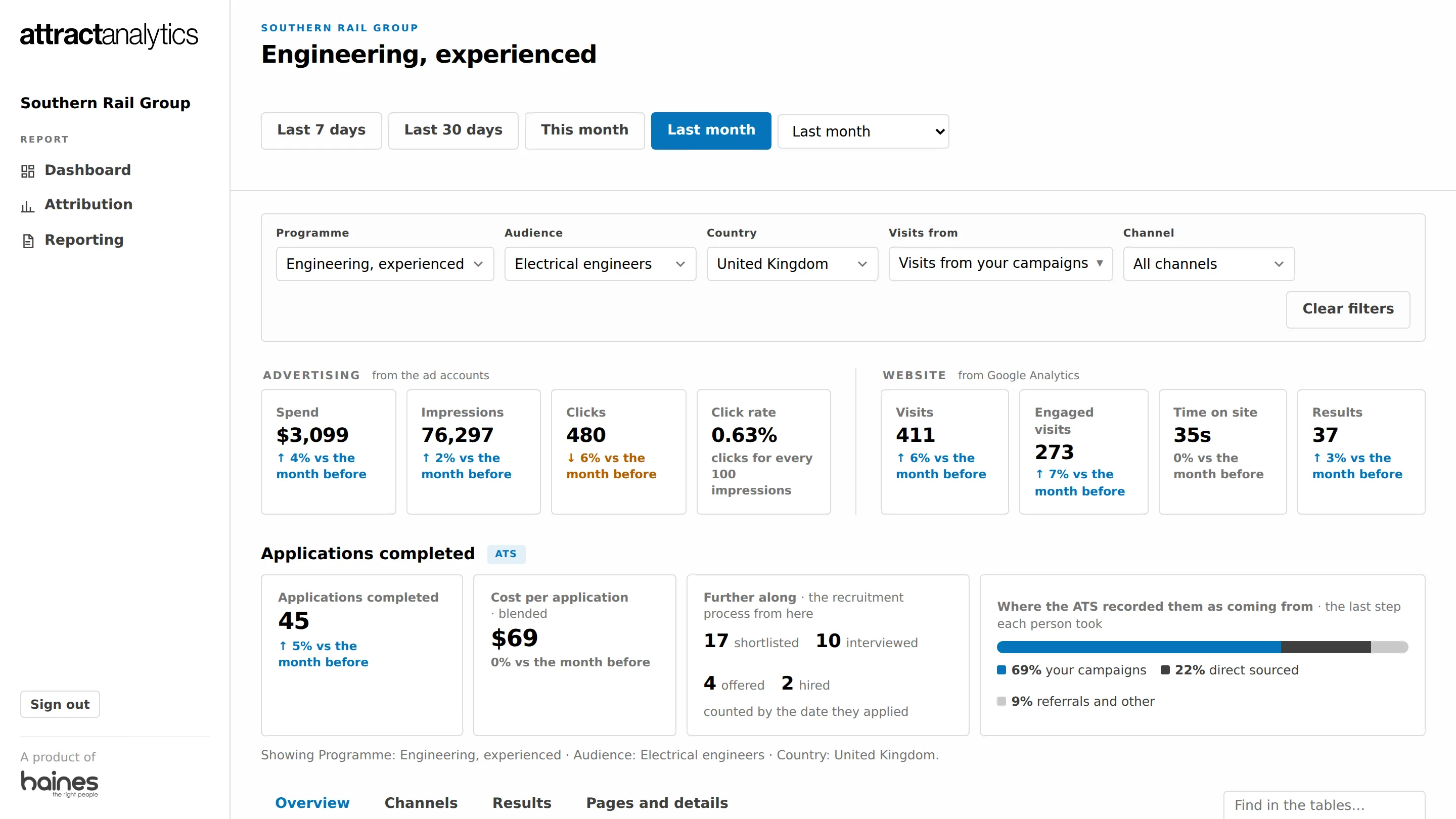
Everything, last month.
All your recruitment or brand advertising in one live dashboard, organised the way you think about it: by programme, by the people you're reaching, by country, by channel.
One role on one job board, or a dozen audiences across several countries and every platform you use, with an always-on programme underneath and a brand campaign on top. Most reporting tools cope with the first and fall over on the second. This one was built to handle whatever you run, however much of it, whether the result you are after is an application or a sale.
Its own view, its own dates, its own comparison with the period before. Brand advertising that is not aimed at one group gets its own line, called General, so it never muddies the numbers for each group.
Workforces, sites, regions, roles, or customer segments and products: whatever you call the groups you advertise to, the dashboard calls them that too.
Compare countries, or Google Search with YouTube with LinkedIn, for one group or for all of them. Every table adds up to the total above it.
Recruitment is where it began, and it is still what most of our clients use it for. It works the same way for a brand that sells to customers, such as an insurer or a retailer: the dashboard, the attribution estimate and the monthly report count what was sold, or enquired about, instead of what was applied for, taken from your own sales report or CRM export.
Every view has an "In short" card. Press it and you get a headline and a handful of plain-English takeaways for exactly what is on screen, results first, against the period before: the point in bold, the numbers behind it underneath. It describes what happened; it does not guess at why. The card here was written from the screen above it, by an AI model, from the numbers you are looking at and nothing else. A first read, not a verdict, but the one you would otherwise be assembling yourself before a Monday meeting.
Built and working. Ask us to switch it on for your dashboard.
| Audience | Spend | Applications |
|---|---|---|
| Engineers | $6,120 | 168 |
| Apprentices | $3,640 | 121 |
| Project managers | $2,905 | 88 |
| Customer service | $2,410 | 79 |
| Analysts | $1,980 | 14 |
| General (no audience) | $1,885 | 42 |
Graduate intake spend up 12%, applications up more
Example, with illustrative figures. Check anything you would act on against the tables.
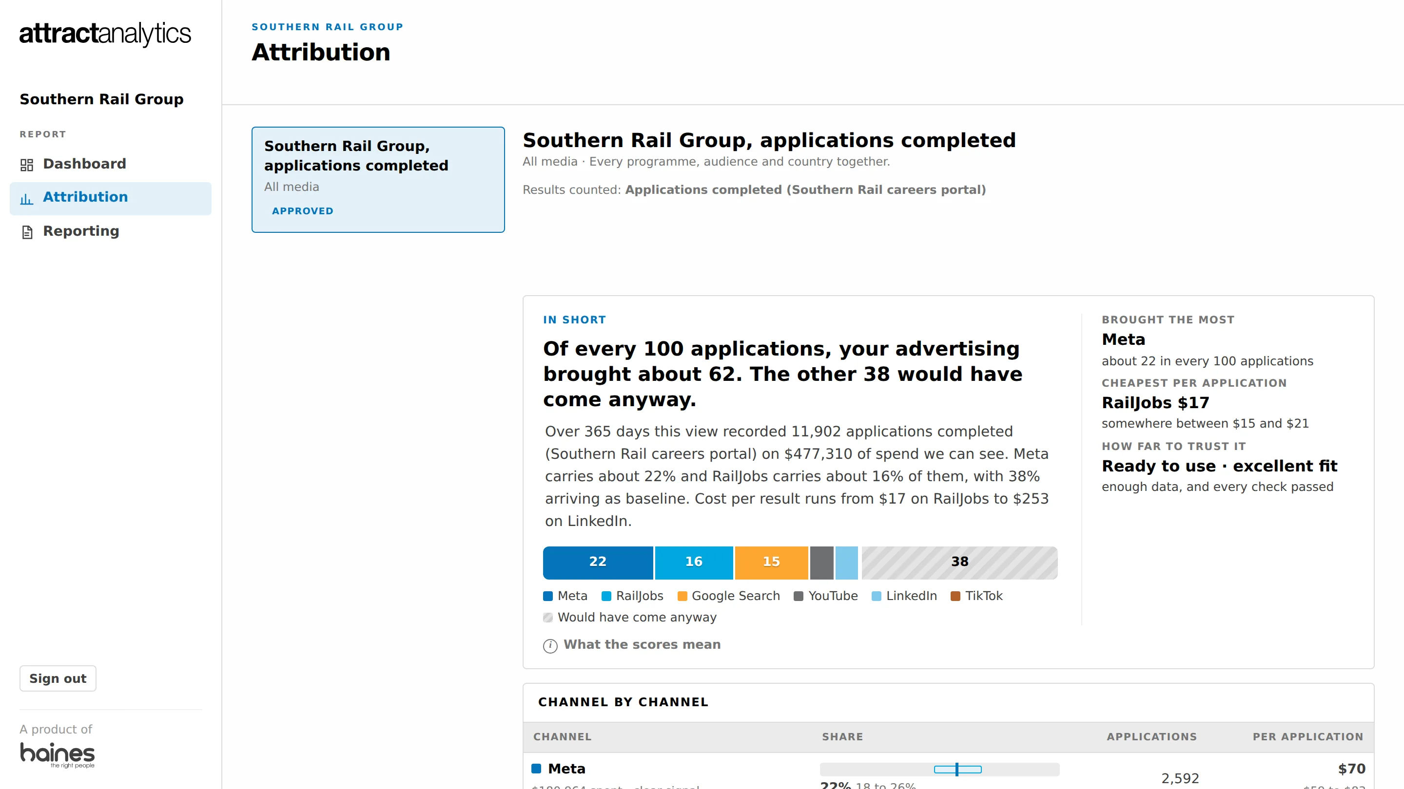
Most reports give the credit for an application, or a sale, to whatever was clicked last. That cannot see the video someone watched 3 days before they searched your name. Our model reads your spend and your applications or sales day by day and estimates how much each channel really contributed, with a range around every figure. When there is not enough data to answer, it says so rather than guessing.
Try the demonstration in your dashboard. Then ask us how to switch it on for your own campaigns.
Where 5,660 applications came from, 24 weeks
Applications completed, as counted by the applicant tracking system. YouTube: under 2% of clicks, 13% of applications. The grey band shows how sure the model is: the narrower, the surer. Invented figures.
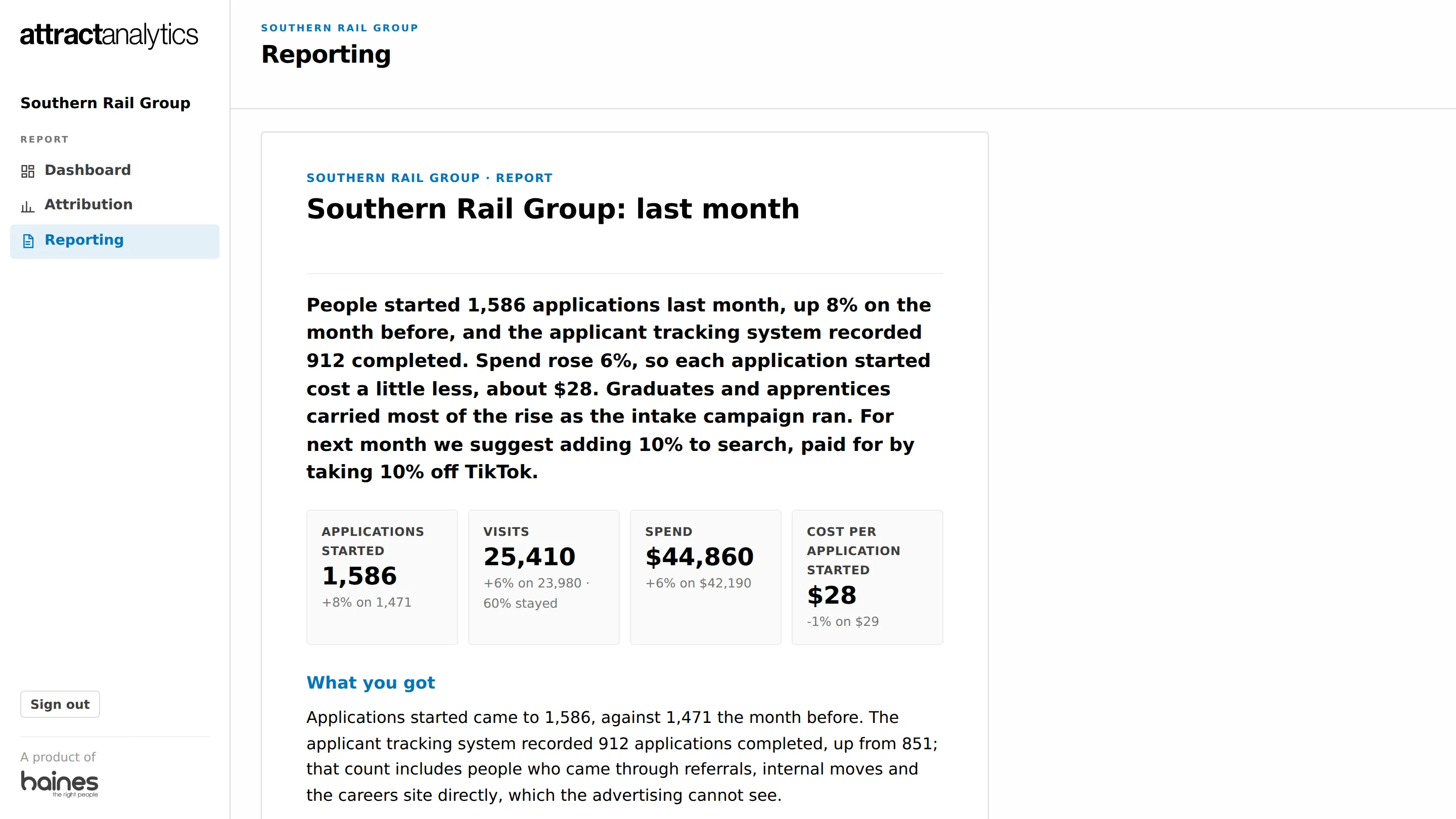
Once a month, a short written report lands in your dashboard: what happened, in plain words with a few pictures, and how we suggest steering the budget next month, channel by channel, in percentages. It is drafted from the same figures as your dashboard, then read, edited and published by your Haines team, so what you get is the numbers with our judgement on top. Where you have an attribution model, the steer leans on that too.
Built and working. Your Haines team publishes it; you read it under Reporting.
August: 412 applications started, up 6% on July, on a little less spend
LinkedIn and Meta carried most of that. Search cost more per application than it did in July. We suggest moving 10% of the search budget to LinkedIn next month.
Percentages, never dollar targets, and never more spend on a channel that is on or off only. Invented figures.
Three steps, most of them ours. Nothing to install or maintain on your side.
Meta, LinkedIn, Google, YouTube, TikTok and your website analytics, connected once. Job boards, newsletters, radio and print have no feed of their own, so we bring their spend in from the invoice or the schedule, and they sit on the same page as everything else. Your applicant tracking system can send us one scheduled report, so the applications people actually completed are counted too, with nothing personal in it. A brand that sells to customers sends a sales report or a CRM export instead, so what was actually sold is counted.
Your programmes, your audiences, the words your teams use. After that, new campaigns land in the right place by themselves, and anything it is not sure about is set aside for a quick yes or no.
Fresh overnight. Pick a period and a programme, click into an audience or a country, read down to the ads that did the work. Your Haines team sees the same screen, and once a month publishes the written report to it.
Campaign reporting has a habit of stopping at clicks. We'd rather you saw the whole line: what was spent, who arrived, what they did next, and how that compares with last time.
Fair question. Most campaign reports, including the ones we used to build, are a dashboard in a tool like Looker Studio. They can show almost anything. The trouble is everything a person has to keep doing behind the scenes so they keep telling the truth about your campaigns. Here is what that looks like from your side.
Tell us which campaigns you'd like to see and who should have a login. We connect the platforms, set it up in your words and walk you through it. No licence, no software, no new supplier.